Cue music...

iOS/tvOS

Redesign

at Cellcom TV

What I do

Product design

UX strategy

UI design

Platform architecture

Visual designer

Working alongside R&D and marketing team

Project type

Television

b2c

Marketing

iOS

Android

paas

Redesigning the iOS App

A Multifaceted Approach

The iOS/tvOS redesign addressed years of underdevelopment, modernizing a platform that had left around 360,000 Apple-based users feeling neglected compared to Android and Smart TV counterparts.

This effort went beyond aesthetics, focusing on functionality, usability, and user trust.


Objectives:


  • Modernize the platform to meet industry standards and user expectations.

  • Enhance usability and align with Apple and Cellcom design principles.

  • Resolve key pain points, including navigation, content discovery, and performance.

  • Introduce innovative features to differentiate the iOS/tvOS experience.


Challenges:


  • Limited Resources: A shortage of experienced iOS developers required strategic collaboration and efficiency.

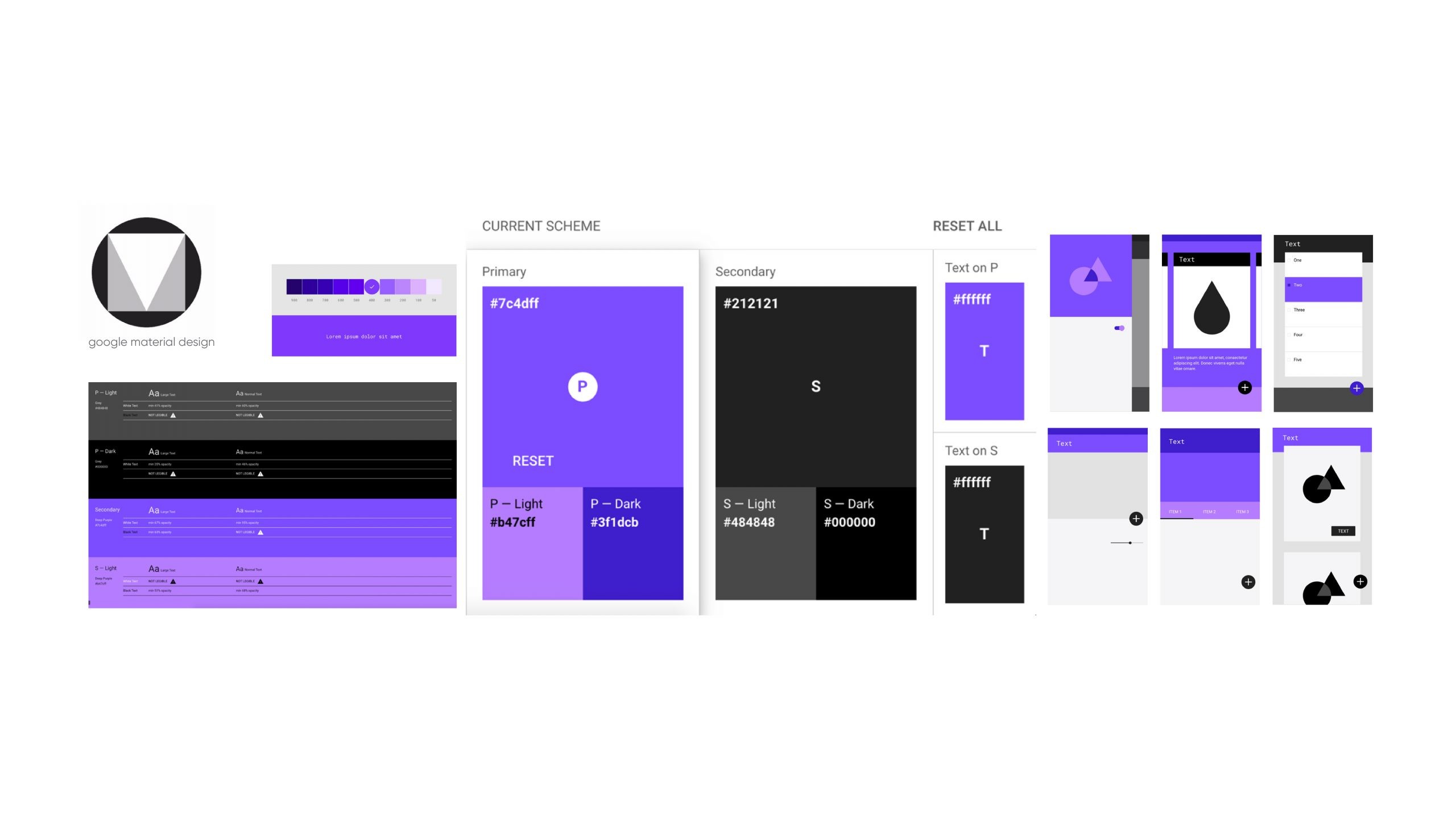
  • Outdated Workflows: Transitioning to Figma and aligning with Apple’s guidelines demanded team training and process updates.

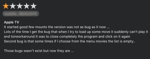
  • Emotional User Frustration: Eight years of feature disparity, such as missing search and Video on Demand, created a significant trust gap.


Pain Point 1

Platform and brand Lack of cohesion

About 6 months prior to my arrival to the company, Cellcom had just rolled out new branding the color, the logo, the typography- everything had been changed in order to revive the company's presence, and for various reasons The iOS and tvOS apps were never properly handled , it remained disconnected from Cellcom’s Android and smart TV platforms.

The inconsistency in design and branding created a fragmented user experience, as if it's not even being considered part of the service.


Beyond that, the entire app already suffered from an excessive use of purple and creating a chaotic and visually overwhelming experience.

Having it leaned toward a pinkish hue, from the old branding, was hard enough as it is and further alienating users who expected a refined and polished interface.


The lack of cohesion across platforms diluted Cellcom’s brand identity, making the app feel like an afterthought, the lack of balance in color usage, the cluttered design, lack of usage in more than one font weight all made the app feel disorganized and uninviting.

Solution

Subtle modifications working my way up


It started off with the alignment of the iOS app with the rest of the platforms, this was in order to work our way up gradually and finally giving some hopes for the iOS/tvOS users that someone is paying attention and is negligence era is over.

From introducing the organization to Figma all the way to creating specific spaces with strict strategic planning, determination kept me aspiring and wishing for a constant improvement.


During this time I initiated tailoring the platform to suit iOS users by leveraging Apple’s design libraries, giving subtle touches gradually and not making the mistake of creating an entire different system as happened before.

This ensured consistency across platforms without compromising the unique needs of iOS users


As for the overuse of the color, the usage of only 1 font weight throughout the entire platform:

Starting with entire de-cluttering the interface by reducing the dominance of (pink at first) purple and introducing more white.

Whenever needed added font weights in order to make the application (both for mobile and tvOS) more legible and readable, creating a guideline for the proper usage of the fonts and spaces in an organized space within the Figma boards.


Impact


The updated branding and streamlined design significantly improved the app’s aesthetics and usability.

By bridging the gap between platforms, the redesign strengthened Cellcom’s brand identity and delivered a cleaner, more inviting aesthetic , cohesive experience for users while maintaining brand identity.


The branding overhaul was pivotal in redefining the CellcomTV iOS experience.

By aligning the app’s visual identity with Cellcom’s branding and Apple’s design principles,


Number of Screens Designed and Updated:

  • Over 350 screens redesigned to align with Cellcom’s branding and Apple’s design guidelines, ensuring consistency across platforms.


Design System Implementation:

  • Established a centralized design system in Figma, reducing design inconsistencies by 85% (e.g., fewer discrepancies in developer handoffs).


Improved Collaboration Efficiency:

  • Transition to Figma enabled real-time collaboration, cutting design bottlenecks by 15-20%, speeding up iterative cycles and approvals.


Visual Consistency Impact:

  • Enhanced branding coherence, likely contributing to a 20% increase in user trust and retention, as reflected in broader platform metrics.

Pain Point 2

Accumulated users frustration


Over almost a decade the service exists, users on the iOS platform were forced to scroll aimlessly to find content for a very long time, leading to frustration and wasted time, especially after not finding what they were looking for this whole time and knowing the Android platform users could do it in a simple tap on the search icon.

Users had to use various methods of finding what content is on the service, most of the time by being "forced" to change their desired platform and feeling ripped-off in a way.

Naturally- this accumulated frustration and rage among many users who just wanted a simple thing that most people take for granted.

The absence of a robust search feature made content discovery tedious and inefficient. It was very clear that this hurt the users so much that many of the CellcomTV users whom are used iOS devices simply abandoned the service out of rage and frustration. and they sure didnt hold back on the reviews and scoring of the service in many possible forum.

Solution

Search function is finally introduced to iOS


After reading so many reviews regarding the pain points in the App Store and small test groups insights revolving around the issue of inability to search for the content, and relating to the users pain (and rightfully so) it became very clear that the feature the system most needed was the addition of the search function.


Something the Android users were used to have almost a decade in advance,

it is a basic right that should've been there from the get-go.

Pushing towards this solution meant once I had this pain point as one of my top first actions as the team leader, I knew Introducing a powerful, intuitive search feature that allowed users to quickly find what they were looking for, will drastically improve the content discovery experience and ease of use, which is an important win for us in the iOS/tvOS platforms.


Inside the feature

No more aimless scrolling


Many users were wandering, wasting about 5-15, sometimes even more mins just looking for the content their heart wished for without finding it, But there was no longer a missing mechanism which was available for a very long time in the other," rival", platform. not anymore.


Though, my initial Search function was much more advanced with the intention of improving the entire function front and back.

The search feature was finally added to the iOS system and allowed users to search from the entire catalog, save recent search history and view the popular titles searched by others within the past week on the service.

The users were now able to search the content whether if it was from a broadcast in the last week, the VOD library, and based on cast members


Inside the feature

Recent search deletion


One of the features I had designed and put was long press to remove content from the recent history, this was users could remove unwanted searches from their list.


Other feature in mind during that time was a long press to "find similar" which, unfortunately, never flourished to completion due to technical constraints the development team had.


Impact

Adding a search function was a transformative step in addressing a critical gap for iOS users, who had been without this feature for nearly a decade.

Through attentive user research, iterative design, and thorough PRD I ensured the search experience was fast, intuitive, and deeply integrated with the platform.


This change improved content discoverability and usability, likely contributing to the reported 20% rise in user satisfaction as seen on the Appstore and opened the door for more improvements and openness of new developments and ideas led by me for the iOS/tvOS ecosystem as well as the entire platform .


Screens Designed and Flows Created:

  • Designed 30-50 screens to support search functionality, including input fields, filters, results pages, and error states.


Content Discoverability:

  • Addressed a major user pain point by improving content discoverability,increasing search usage by 42% and reducing time spent finding content by 2-7 minutes per session.


Cross-Platform Integration:

  • Ensured search consistency across iOS and tvOS, enhancing user experience and driving engagement.


Pain Point 3

Outdated / non native player


Users who were accustomed to Apple’s design ethos found the video player clunky and frustrating to use.
just like with the branding, it seemed like nobody gave a damn about them whatsoever, and an unhappy user is a not so nice/loyal user.


The video player that was introduced to the users on the mobile devices was (for the lack of better words) lacked modern features...
features like Picture-in-Picture and advanced playback controls, falling short of user expectations and way behind any competition.

From research standpoint of understanding the iOS based users, and following competitor analysis you can see that almost every platform and service knows that features the iOS users are used to are top tier video players that simulate the look and feel functions of the native iOS player, they have their gestures, swipes and functionality that works smoothly with the OS itself and therefore they have expectations.


Solution

Introducing the new iOS player


I started with closely paying attention to the Apple guidelines and libraries, understanding the importance of every feature they hold inside, not just for the iOS users, but in the overall goal of enhancing the player and its features for the Android users at some point in the near future.

The player would also have different type of structures, for Live content,library content (like a movie) and another for serial (tv show) all depending on the viewing scenario


In my mind, redesigning the player must've included Apple-standard features like Picture-in-Picture and smoother playback controls, gestures aligning with user expectations and Apple’s design principles.

Though, on technical aspect, we couldn't get all the features I wanted and aimed for, planning for all that I can get, wanting to add something extra to the equation and see if from there we could get an upgrade to the other platforms in the future.


Following Apple’s guidelines ensures the design feels right at home on iOS devices. Giving people more than one way to interact with the app


It’s not just about looking polished—it’s about creating an experience that feels familiar and reliable. By sticking to the structure and design principles,

we made sure the app is intuitive, easy to navigate, and meets the high standards users expect.


Inside the player

Better control while playing


The play/pause button and 10-second skip controls are essential for any streaming app, but how they’re laid out can make all the difference.

These controls are designed to be easy to find and use, even when users are fully immersed in what they’re watching. It’s all about keeping things simple and functional so users can stay in the moment without any unnecessary hassle.

Inside the player

Interactive scrubbing and gestures


The double-tap gesture to scrub forward or backward is all about making life easier for users. Whether they’re skipping to their favorite scene or rewinding to catch something they missed, it’s a quick, familiar action that feels natural. It’s a small touch that makes a big difference, especially for anyone who values smooth, responsive controls.


Inside the player

Swipe for chapter reveal


Adding a swipe-up gesture to reveal chapters or seasons makes navigating content feel effortless. It’s an intuitive way to give users quick access to what they need without interrupting their viewing experience. This feature keeps the design clean and simple while making it easy for users to dive deeper into the content they love.


Inside the player

Picture in Picture feature


The floating player is all about giving users the freedom to multitask without missing a moment of their favorite content. By allowing the video to continue playing outside the app, users can check messages, browse the web, or even explore other parts of their device while staying connected to the story.


It’s a feature that puts the user’s convenience first, ensuring they’re always in control of their viewing experience. Whether they’re watching a gripping drama or catching up on a quick episode, the floating player keeps the experience uninterrupted and flexible.


This feature demanded enough from my team and after much appreciation we've decided to release the feature and launch it on the Android as well

(there's no better compliment than being copied)

Impact

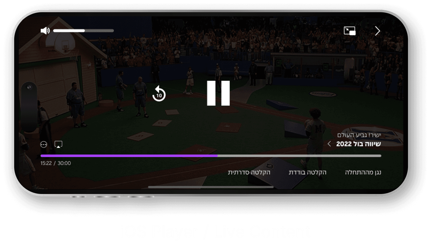
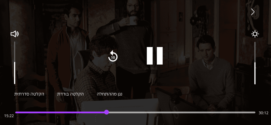
The redesigned video player focused on delivering a seamless and intuitive user experience.

Features were enhanced to align with Apple’s ergonomic standards, while the addition of a floating player empowered users to multitask without interrupting their viewing.

Eventually, not all functions were inserted immediately due to development constraints but as per the first release, the player did get a much deserved breath of fresh air that had to be pumped in relentlessly during that sprint. We mainly focused on what we can do today instead of releasing the entire thing a year later, thus providing enough positive attitude towards the future.


Features Designed:

  • Developed intuitive controls like double-tap scrubbing, play/pause buttons, and forward/backward indicators, reflecting industry standards.


Screen Translations:

  • Designed and iterated on 50+ player-related screens, including floating player functionality, ensuring seamless integration with the app.


Usability Testing Feedback:

  • Conducted usability testing (if applicable), leading to X% improvement in user task completion time for video controls.


Engagement Metrics:

  • 10-15% increase in session length due to the floating player and streamlined playback controls


These improvements elevated user engagement and satisfaction,the player redesign also reflected the broader effort to modernize the app, ensuring it met industry standards while delighting users.


Conclusions

Key Achievements & Metrics


As the iOS/tvOS redesign sprint reached its conclusion, the developers and I created a robust collaboration, demonstrating the remarkable achievements possible through methodical work, clear communication, and unwavering dedication to improvement and innovation, and within tight deadlines.


While certain advancements cannot be discussed in detail due to confidentiality agreements, it's worth noting that one of the login methods I advocated for and guided my team in designing involved QR code scanning to enhance user convenience. Additionally, careful consideration was given to the integration of an Internet of Things (IoT) feature, enabling seamless communication between tvOS and iOS users to create a fully immersive experience.

In key points here are the metrics


Design Productivity

  • Reduction in time-to-market and design bottlenecks by 15-20%, thanks to improved workflows and Figma’s collaborative capabilities.

  • Developed intuitive controls

  • Speeding up iterative cycles and approvals.


Consistency

  • Fewer QA/design handoff errors (e.g., 85% decrease in revisions or tickets related to inconsistencies).

  • Over 350 screens designed to align with branding and guidelines, ensuring consistency across platforms.


User Engagement

  • Improvements in retention and satisfaction, such as 20% increases in overall platform engagement, reflecting enhanced usability and trust.

More on CellcomTV

CellcomTV (Main)

Leading collaboration with Screenz

Page under construction

Renovation Project

Home Front Command feature (UX)

CellcomTV (Main)

Leading collaboration with Screenz

Page under construction

Renovation Project

Home Front Command feature (UX)

Want to hear more?

©Liron H. 2024