


iOS/tvOS
Redesign
at Cellcom TV
What I do
Product design
UX strategy
UI design
Platform architecture
Visual designer
Working alongside R&D and marketing team
Project type
Television
b2c
Marketing
iOS
Android
paas


Enter CellcomTV
Background, Role & Challenges
CellcomTV, the streaming platform of Israel’s telecommunication Cellcom, entered the market a decade ago, offering a mix of on-demand content and live TV. While it initially gained traction, the competitive landscape rapidly shifted with platforms like Partner TV, Sting TV, Yes+, Hot, and FreeTV pushing innovation.
Challenges
Despite its early success, CellcomTV struggled with a fragmented user experience across tvOS, Android, iOS, and Smart TVs.
Inconsistent UI, outdated design patterns, and inefficient workflows led to user frustration, higher churn rates, and disengagement.
The lack of a unified design system and streamlined user flows made navigation cumbersome, impacting overall usability and retention.
Objectives
As Lead UX & Product Designer, my mission was to reinvent CellcomTV into a seamless, intuitive, and modern streaming experience. By leveraging user-centered design, strategic product thinking, and cross-functional collaboration, I aimed to:
Unify the platform’s UX/UI for consistency across devices
Simplify navigation and interactions to reduce friction
Improve accessibility and engagement through intuitive workflows
Enhance internal design processes to accelerate future iterations
This transformation wasn’t just about aesthetics—it was about creating a smarter, more connected viewing experience that redefined how users interacted with CellcomTV.
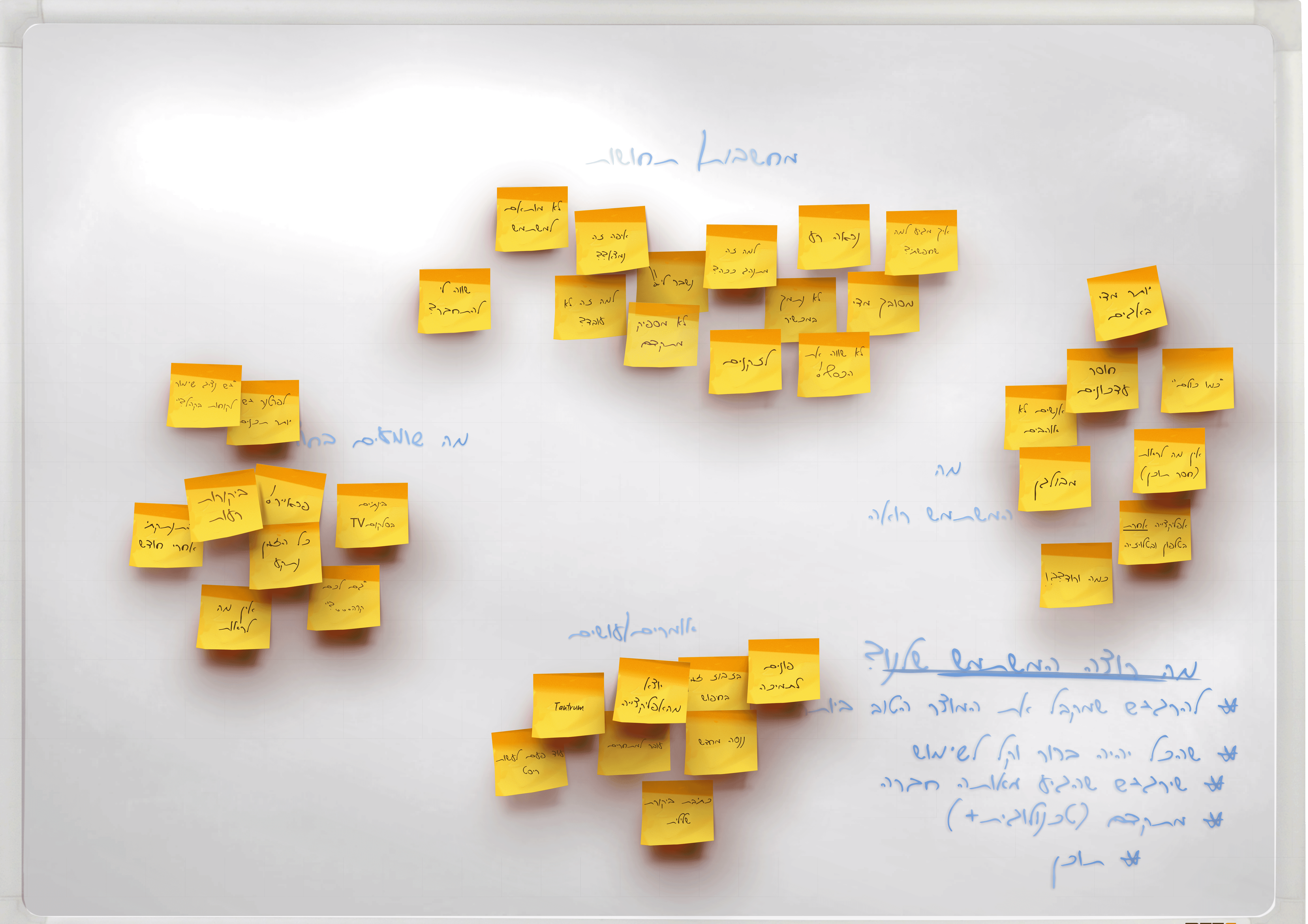
Research & Discovery
Building Empathy and Uncovering Insights
To transform CellcomTV into a seamless and competitive streaming experience, I needed to understand where users struggled and why.
Through “Listening to the Voices on the Couch,” I conducted in-depth research combining behavioral analysis, user testing, and competitive benchmarking. Heatmaps and analytics revealed critical drop-off points, while usability tests exposed inefficiencies in search, navigation, and content discovery.
Comparing CellcomTV against platforms like Netflix and Apple TV highlighted key areas where the experience fell short, making it clear that users weren’t just searching for content—they were battling the interface to access it.
To humanize the data, I gathered direct user feedback through surveys and interviews, developing personas that represented distinct user needs.
While the Binge-Watcher craved frictionless content discovery but faced inconsistent interfaces, The Family Streamer struggled with cumbersome parental controls, and The Casual Viewer found search results overwhelming.
These insights shaped a structured design strategy, by anchoring every decision in research and empathy, this phase laid the foundation for a transformation that prioritized functionality, intuitiveness, and a truly user-centric experience.
The digital evolution of CellcomTV required a strategic overhaul to meet the changing needs of its user base.
Through a comprehensive approach focusing on unified design, streamlined navigation, and adaptive team collaboration, significant strides were made to enhance user experience and operational efficiency.
Pain Point 1:
Disjointed User Experience & Navigation
Inconsistent User Experience Across Devices:
The initial platform design lacked coherence across different platforms (tvOS, Android, iOS), resulting in users facing different interaction models, visual styles, and functionalities.
This inconsistency not only confused users but also diluted the brand's identity across touchpoints.
Complex Navigation meets Cognitive Load
In its early iterations, CellcomTV featured a labyrinthine navigation system, where users often got lost trying to find their desired content.
This complexity led to high drop-off rates, especially among new users who expected a more intuitive interface.
The effort required to navigate through the service was substantial due to non-intuitive menu structures and hidden functionalities, which took away from the enjoyment of content consumption and led to (in many cases) user fatigue.
Solution
Navigation & Enhanced Usability
Revised Information Architecture:
Conducted a thorough analysis to consolidate and declutter content categories, simplifying the menu structure while ensuring comprehensive coverage.
This was achieved by adopting a more horizontal navigation model, reducing the depth of menu layers.
Optimized User Flows:
Utilized insights from user research, including journey maps and behavior analytics, to design a navigation system that felt natural. This included implementing predictive search capabilities and smart content recommendations based on user behavior.
Unified Design System:
Developed a robust design system that included not just visual elements like fonts and colors but also interaction patterns, animations, and transitions. This system was rigorously tested for consistency across devices, ensuring that once users learned one platform, they felt at ease with others.
This involved setting up design tokens that could be used across all platforms to maintain brand integrity.
Impact
By addressing these pain points comprehensively, CellcomTV achieved a significant increase in user satisfaction scores, reduced bounce rates, and a marked improvement in user retention, particularly among casual viewers turned into frequent users.
Pain Point 2:
Workflow & Team Collaboration
Slow Feature Rollout
Before my arrival to the company, the main tools used were Photoshop and Zepling, excellent tools but the lack of more advanced integrated tools and unified processes meant that new features could take months from conception to delivery. This delay was not just due to technical challenges but also because of poor communication and alignment between teams on a weekly basis.
High Error Rate
Without clear documentation and streamlined handoff processes, design interpretations often led to development errors.
This was compounded by the absence of a shared understanding of project goals across departments.
Solution
Adaptive workflow & Team collaboration
Figma Workspaces for Efficient Handoff
Introduced team-specific Figma workspaces, each tailored with components, design libraries, and documentation relevant to their platform (iOS/tvOS, Android). This not only clarified responsibilities but also allowed for real-time collaboration and feedback.
Cross-Department Coordination
Implemented a schedule of cross-departmental sync meetings, created shared project dashboards for visibility, and established clear success metrics for each phase of development. This fostered a culture of accountability and teamwork.
Impact
The new collaborative processes dramatically reduced the time to market for new features, improving CellcomTV's agility in responding to user needs and market trends.
Error rates in development dropped, leading to a more stable and user-friendly platform.
Conclusions
Key Achievements & Metrics
35% reduction in navigation-related complaints.
18% increase in task completion rates.
25% increase in tvOS engagement following the VOD purchasing rollout.
40% reduction in design handoff errors.
25% faster feature rollout cycles due to streamlined workflows.
These outcomes transformed CellcomTV into a unified, competitive streaming platform that not only addressed critical user pain points but also elevated internal collaboration and efficiency.
As the iOS/tvOS redesign sprint reached its conclusion, the developers and I created a robust collaboration, demonstrating the remarkable achievements possible through methodical work, clear communication, and unwavering dedication to improvement and innovation, and within tight deadlines.
While certain advancements cannot be discussed in detail due to confidentiality agreements, it's worth noting that one of the login methods I advocated for and guided my team in designing involved QR code scanning to enhance user convenience.
Additionally, careful consideration was given to the integration of an Internet of Things (IoT) feature, enabling
The future
Of CellcomTV
By prioritizing user-centric design, operational efficiency, and feature innovation, CellcomTV evolved from a fragmented, outdated platform into a cohesive and competitive streaming service.
Looking ahead, further opportunities exist in personalization, content expansion, and emerging technologies to keep CellcomTV at the forefront of Israel’s streaming market. By maintaining an agile, data-driven, and user-focused approach, the platform can continue adapting to changing user needs and technological advancements
For legal reasons(NDA) I cannot share at this moment more projects done within my position.
I will, for now, mention them briefly as they were and are important projects within the scope of my position
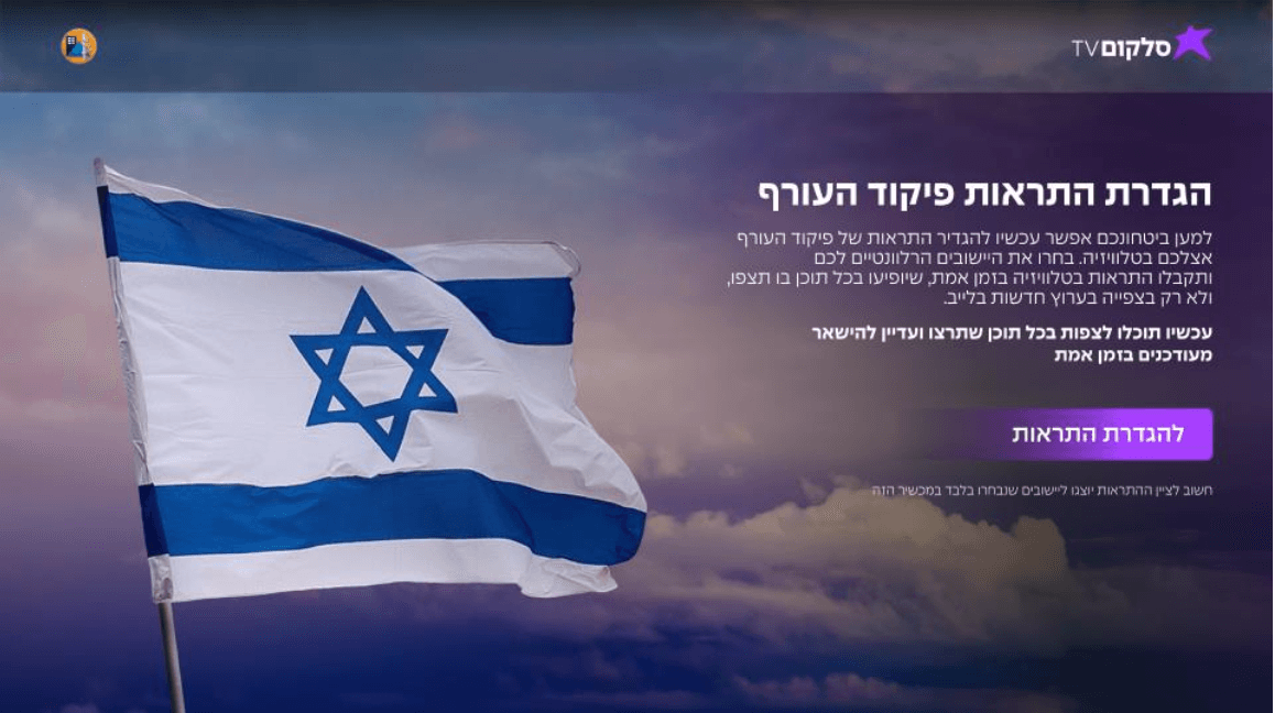
1. Home Front Command Feature (UX Focused)
Following the tragic events of October 7, we expedited the development of a real-time rocket alert system, ensuring accurate and immediate notifications for users, synchronized with Israel’s Home Front Command.
2. 'In The Game' Interactive Collaboration
Designed an interactive engagement layer for live content, enabling users to participate in real-time events directly from their screens.
3. Project Cassandra: The Next-Gen CellcomTV Platform
Oversaw UX inspections and strategic alignment to ensure the upcoming Project Cassandra meets modern standards and maintains competitiveness.
More on CellcomTV

CellcomTV (Main)

Leading collaboration with Screenz
Page under construction

Renovation Project
Home Front Command feature (UX)